BRAND IDENTITY / PACKAGING / ADVERTISING
EMBER
COFFEE
A conceptual coffee brand exploring warmth, ritual, and the everyday energy behind a familiar habit.
COFFEE BUILT
AROUND RITUAL.
EMBER is a conceptual coffee brand built around the feeling of warmth, focus, and the everyday ritual of preparing coffee.
The identity combines bold typography, warm tones, and confident packaging to create a brand that feels energetic without becoming chaotic.
The goal was to create a flexible visual system capable of moving across packaging, advertising, social content, and future campaign applications without losing its personality.
BRAND SYSTEM
BUILT TO LIVE
BEYOND THE BAG.
The EMBER identity was designed as a system rather than a single package, allowing the brand to extend into advertising, digital content, and campaign applications.
THE IDENTITY
A SYSTEM BUILT
FROM HEAT and FOCUS.
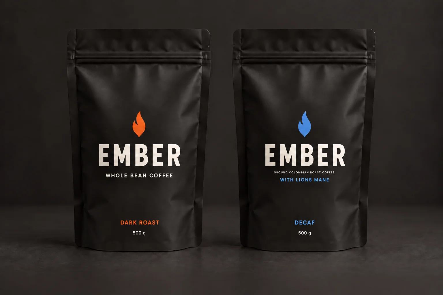
EMBER pairs bold, clean lettering with a simple flat flame. Orange identifies Dark Roast and blue identifies Decaf with Lions Mane, keeping both varieties part of one clear family.
01 / VISUAL LANGUAGE
WARM.
BOLD.
FOCUSED.
The system balances expressive color with a restrained structure, allowing EMBER to feel energetic and focused while maintaining a premium, contemporary character.
THE VOICE
BUILT FOR
EARLY MORNINGS
AND LATE IDEAS.
Bold, clean lettering gives EMBER its presence. A flat flame adds a recognizable signature, while quieter supporting text keeps the packaging clear and easy to read.
PRIMARY DISPLAY / EMBER WORDMARK
EMBER
DARK ROAST ·
500 g
LIONS MANE · DECAF
500 mg
SUPPORTING TYPE / SIMPLE & CLEAR
WHOLE BEAN and GROUND COFFEE
Simple uppercase lettering keeps the coffee type and roast easy to find. Orange marks Dark Roast; Blue marks Decaf with LIONS MANE. Every line has room to breathe.
IN THE WILD
BUILT TO
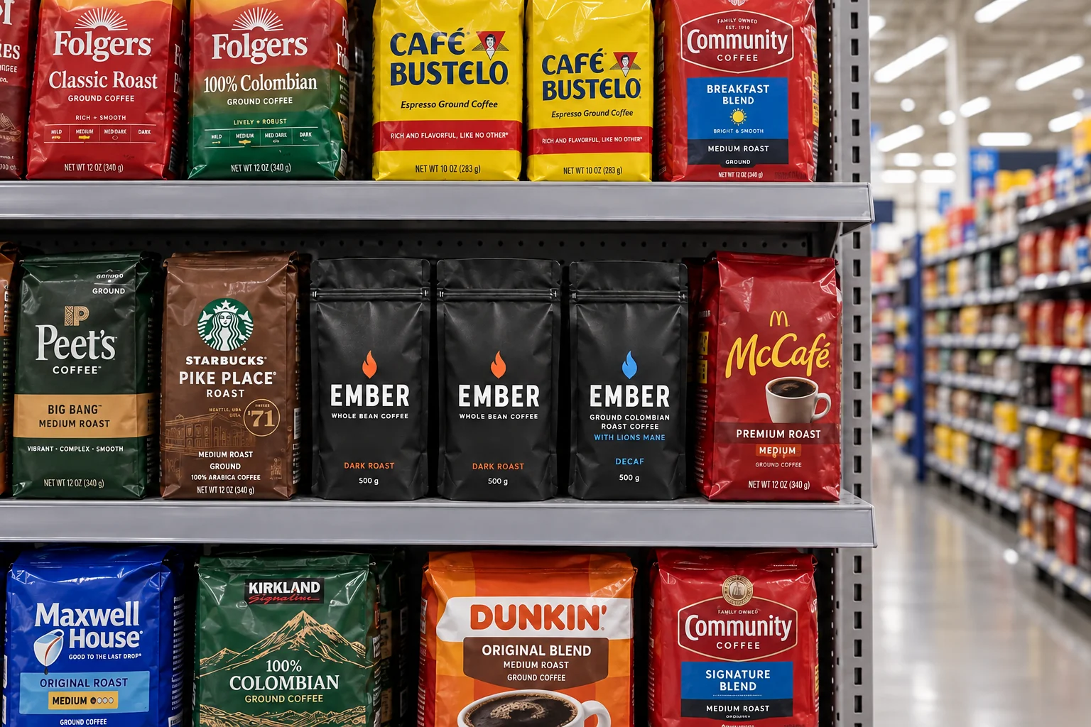
SHOW UP.
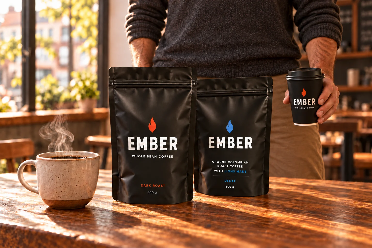
From a morning coffee to the grocery shelf, the same simple identity holds together. These concept scenes show how the packaging could live in everyday settings.